
01
Overview
What is Microsoft Reactor?
Microsoft Reactor is a platform that provides free online and in person events and resources to help students, developers, and entrepreneurs build their skills and businesses.
The Challenge
When I joined the project, the Reactor website was operating without adherence to Microsoft's brand standards and suffering from an outdated interface and a poor user experience that caused friction with browsing, registration, and engagements within the platform.
The Ask
The Reactor team wanted a comprehensive redesign to transform the Reactor website into an easy to navigate and user-friendly platform aligned with Microsoft's new Fluent 2 design system and accessibility standards.
Key Project Goals
Brand alignment: Redesign visual interface to align with Microsoft's brand and new Fluent 2 design system and meet WCAG 2.1 AA accessibility standards
Enhanced user experience: Improve desktop/mobile responsiveness, navigation and browsing experience, and registration flows
Increased engagement: drive measurable improvements in
Increased event registration
Increased video viewership
Decreased bounce rates
Cross team impact: Hit partner team OKR goals by driving traffic to Microsoft Learn, Founders Hub, MVP, etc.
Duration
4 months
Team
UX/UI Designer - Julie Wu
Sr. Program Manager - Dionne Corey
UX Designer Manager - Jeff Arnold
2 Reactor developers
Microsoft Coherence design team
Microsoft accessibility team
Role
UX Design
UI Design
Prototyping
UX Copywriting
02
My role
As the lead UX/UI designer on this project, I owned the end-to-end design process including:
Stakeholder alignment - uncovered underlying business goals and managed expectations
User research synthesis - analyzed existing data to validate design decisions
High fidelity design mockups
Interactive prototypes
Technical design documentation
I also collaborated closely with:
Program Manager - to ensure alignment with business objectives and timely delivery
Reactor dev team - to avoid technical and resource constraints and align on design specs
Microsoft's Coherence design team - for general UX design review & feedback
Microsoft's accessibility team - to meet best accessibility UX standards
03
My design approach
Week 1: Discover and understand
I love to start by understanding the real problems. I analyzed existing user research data, audited the current site, and had probing conversations with stakeholders to uncover what they actually needed versus what they asked for.
Week 2: Design System Deep Dive
I immersed myself in Microsoft's Fluent 2 design system, studying best practices and analyzing how partner sites like Microsoft Learn implemented it.
Weeks 3-12: Iterative Design
This is when I got my feet wet and dived into creation and problem solving. I would design, get feedback, refine, repeat. Nothing fancy, just consistent collaboration with my PM and stakeholders until we got it right.
Week 13- 14: Development Handoff
I delivered everything developers needed: responsive designs for all breakpoints, interactive prototypes for complex flows, edge cases, loading states, and thorough design spec documentation so they could build without guessing.
04
Site architecture
Through this redesign, I touched every single page on the Reactor platform while also creating entirely new pages and flows that didn't exist before.
BEFORE - Basic site architecture:

AFTER - Expanded site architecture:

This wasn't just a visual refresh. I reimagined how the entire platform functions, creating new opportunities for user engagement while ensuring every page, old and new, works together as a cohesive system.
Through this redesign, I touched every single page on the Reactor platform while also creating entirely new pages and flows that didn't exist before.
BEFORE - Basic site architecture:
AFTER - Expanded site architecture:
This wasn't just a visual refresh. I reimagined how the entire platform functions, creating new opportunities for user engagement while ensuring every page, old and new, works together as a cohesive system.
05
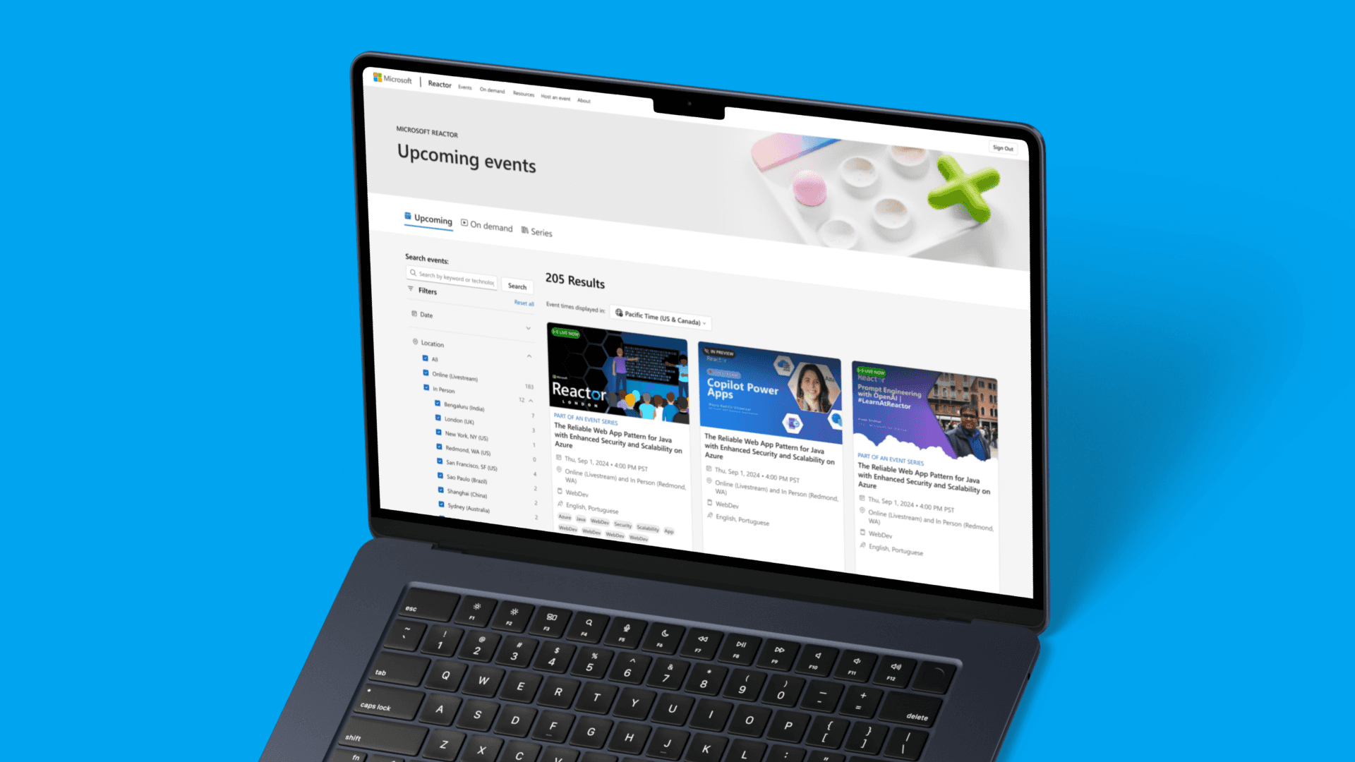
Deep dive into the events page redesign
Here's a closer look into one of the major pages I redesigned— the events page.
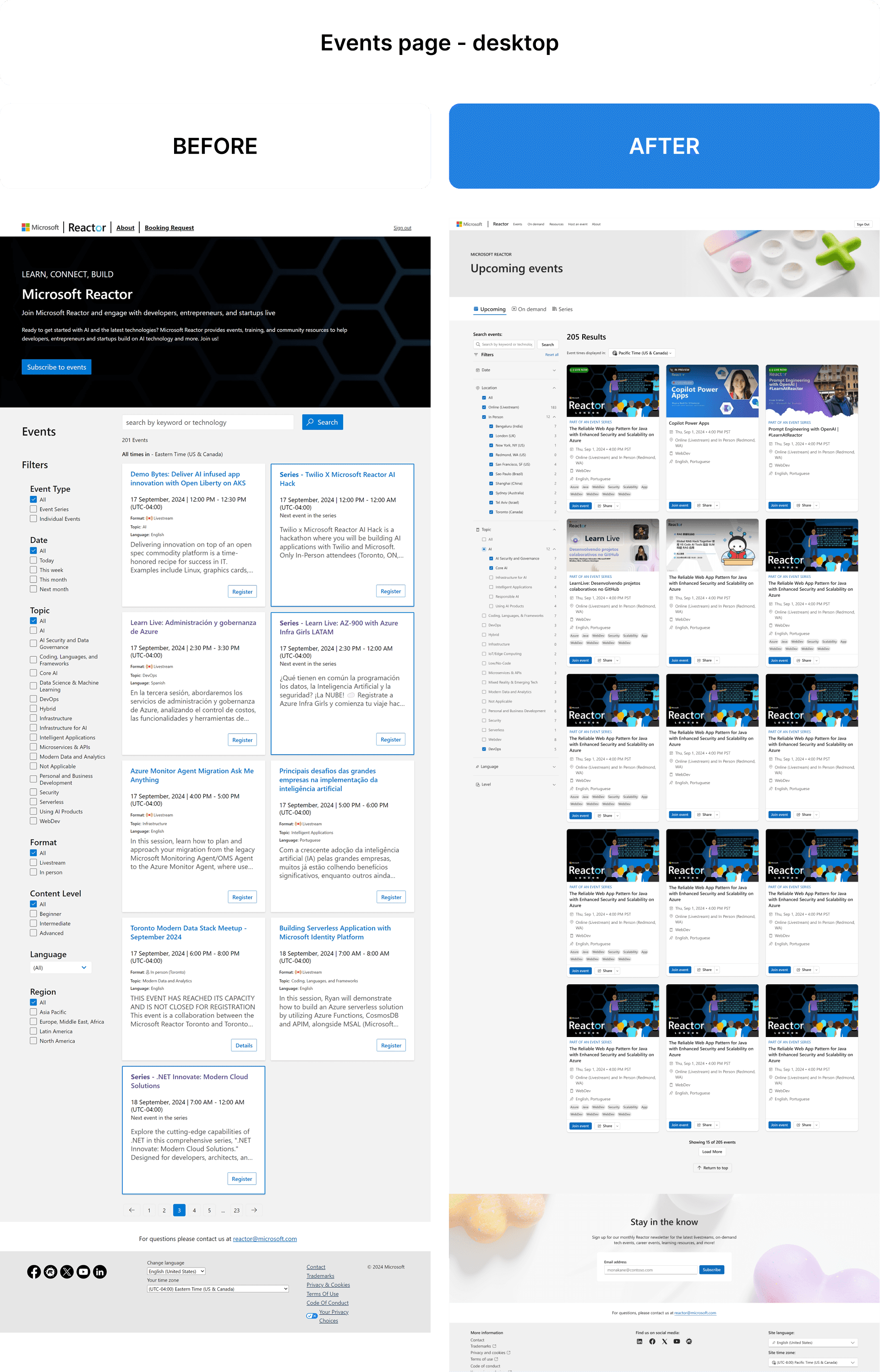
The events page currently functions as both the landing/home page and where users can find all events. However, as part of a new product release, the team would like to have a dedicated and separate home page.
The purpose of the new events page is to encourage users to browse all events (new, old, series) and then join/watch those events.
So how does the current page do?
At a quick glance, it's quite overwhelming and text heavy on the eyes. The filtering and browsing experience is quite rudimentary and chaotic, even more so on mobile!
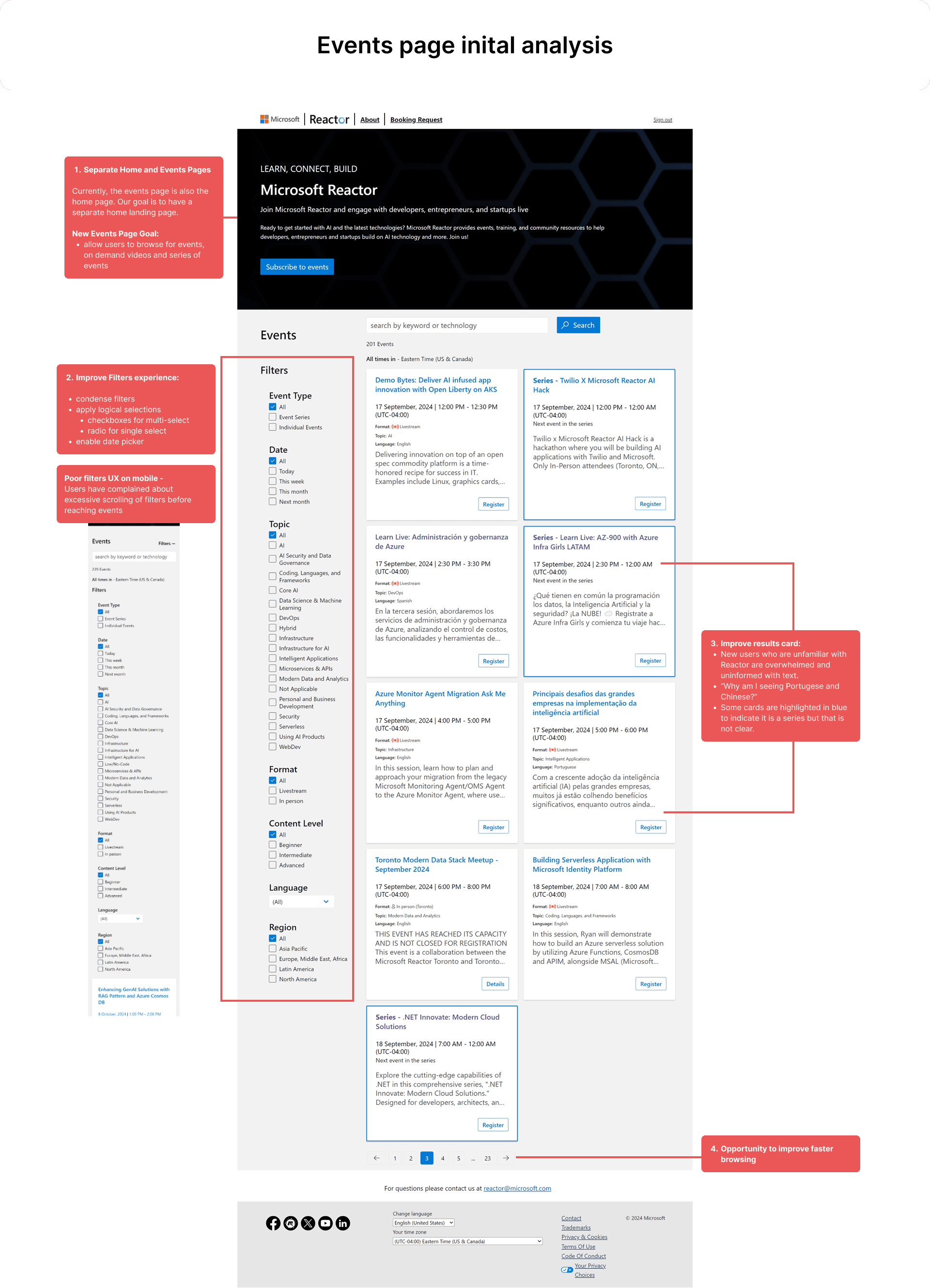
Here's my take on the new visual redesign + UX improvements below:
The mobile UX was improved here as well with better filtering options:
Here's a side by side comparison of the mobile design before and after my redesign:
Here's a closer look into one of the major pages I redesigned— the events page.
The events page currently functions as both the landing/home page and where users can find all events. However, as part of a new product release, the team would like to have a dedicated and separate home page.
The purpose of the new events page is to encourage users to browse all events (new, old, series) and then join/watch those events.
So how does the current page do?
At a quick glance, it's quite overwhelming and text heavy on the eyes. The filtering and browsing experience is quite rudimentary and chaotic, even more so on mobile!
Here's my take on the new visual redesign + UX improvements below:
The mobile UX was improved here as well with better filtering options:
Here's a side by side comparison of the mobile design before and after my redesign:
06
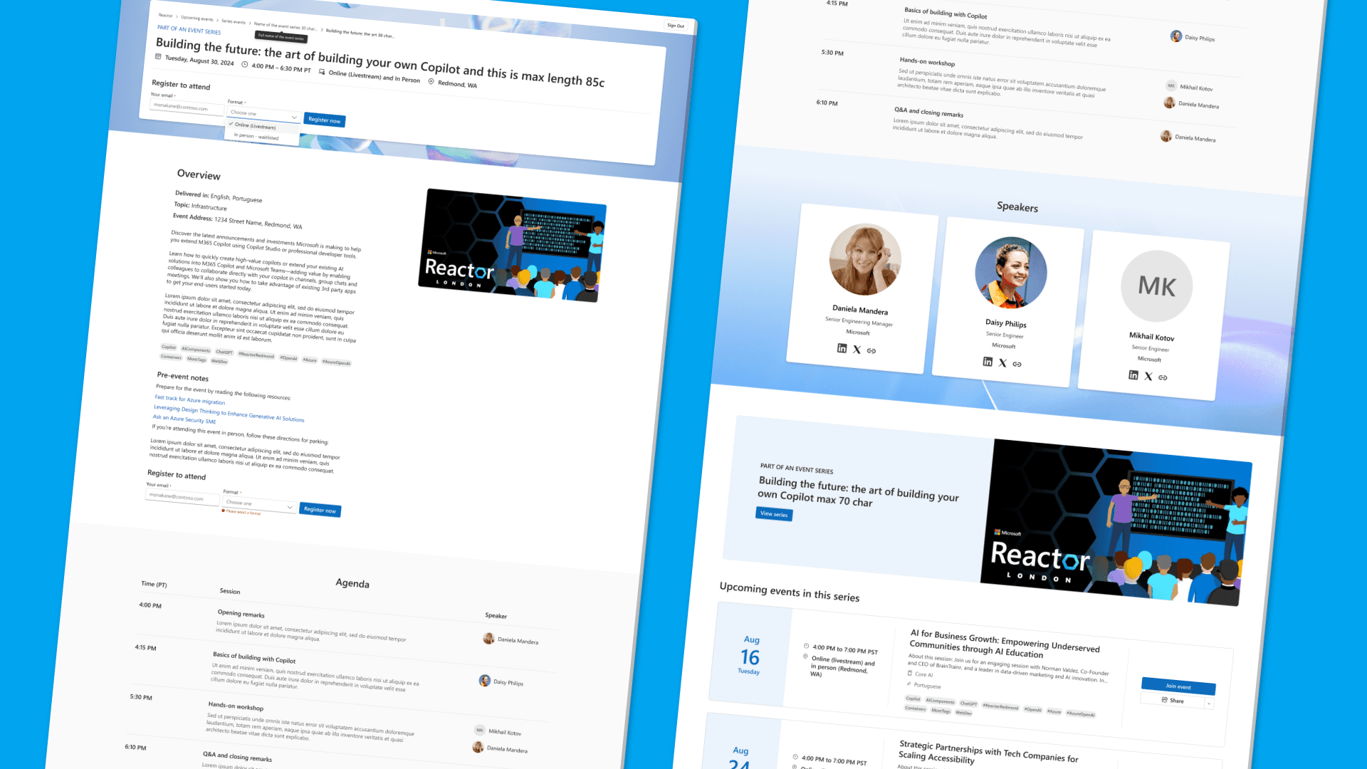
Building sitewide components for easy development
As I redesign the Reactor site, I end up creating new components that can be reused site wide. To make it easier for my devs to build, I would organize my components and spec out the designs for responsiveness and edge cases.
Here's an example of that looks like:
As I redesign the Reactor site, I end up creating new components that can be reused site wide. To make it easier for my devs to build, I would organize my components and spec out the designs for responsiveness and edge cases.
Here's an example of that looks like:
As I redesign the Reactor site, I end up creating new components that can be reused site wide. To make it easier for my devs to build, I would organize my components and spec out the designs for responsiveness and edge cases.
Here's an example of that looks like:
07
A comprehensive design beyond the happy path
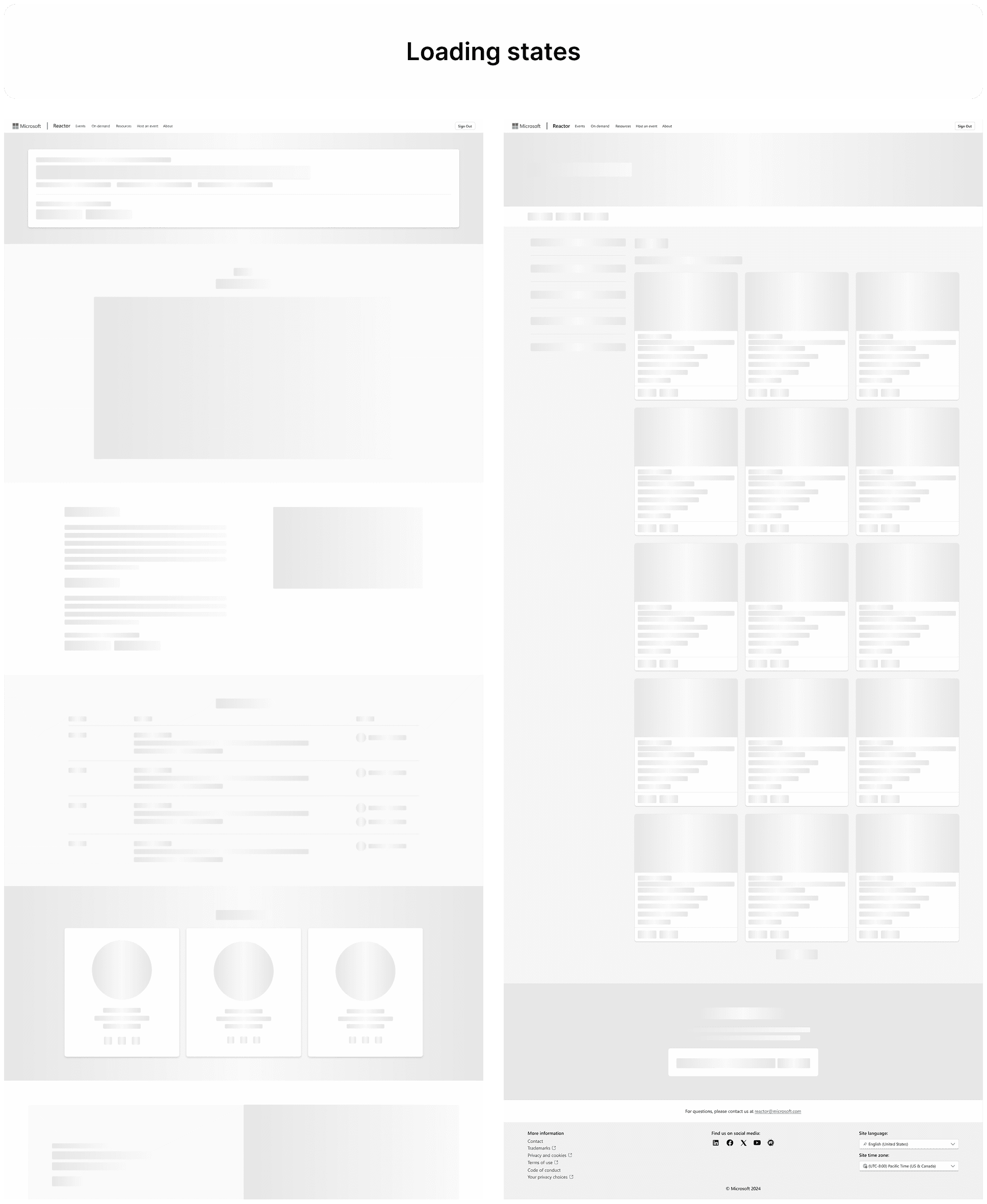
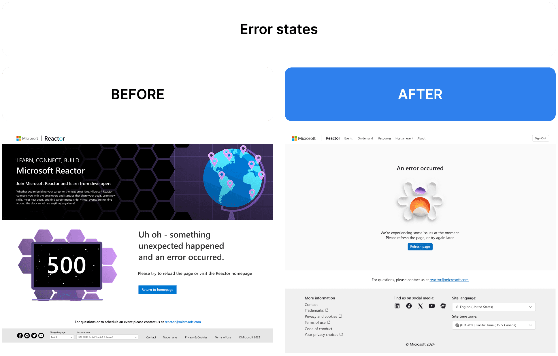
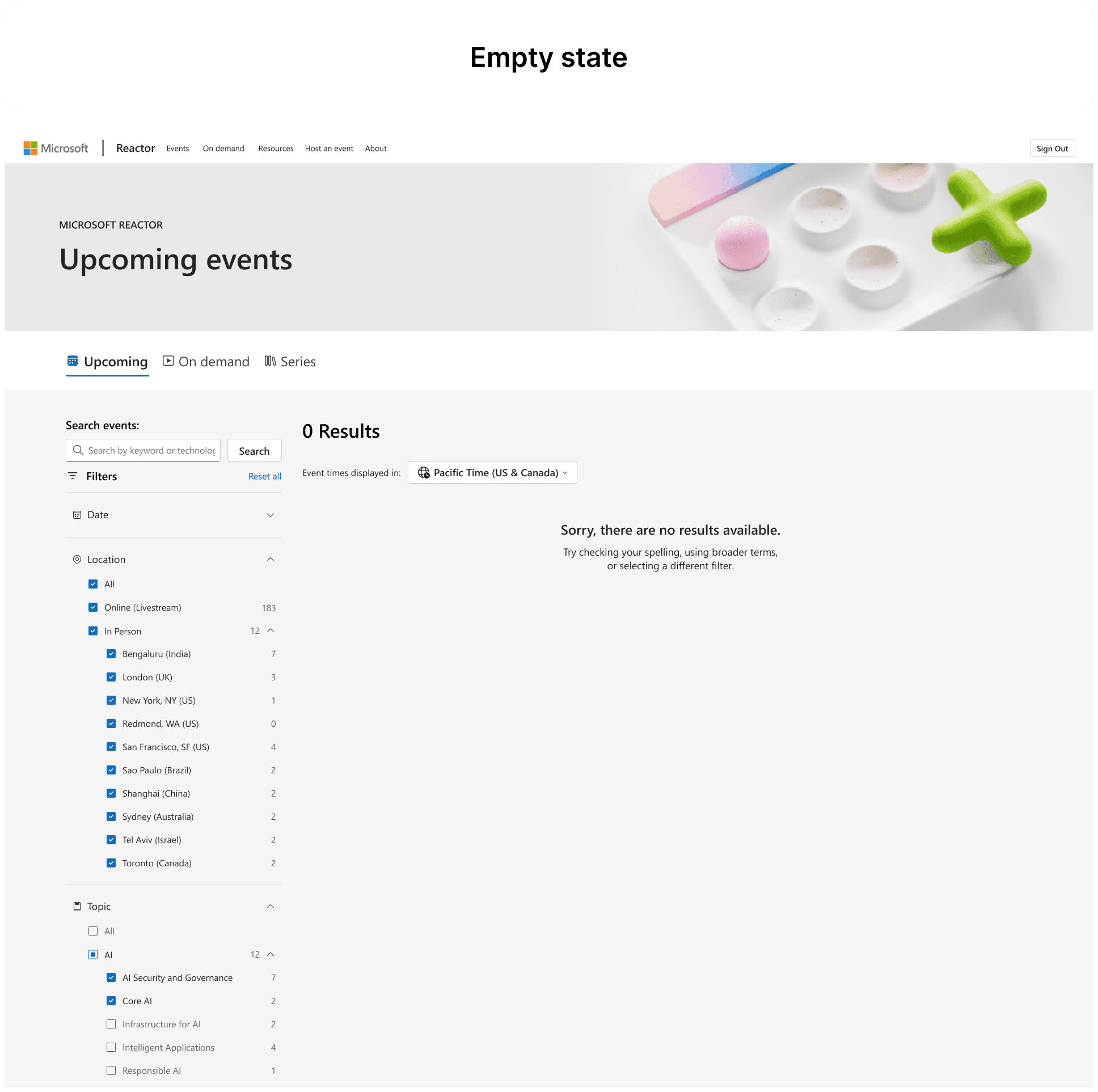
I designed for a complete redesign of Reactor which also means not forgetting the following states of design:
Error states - 404 pages, validation errors, failures
Loading states - skeleton loaders, progress indicators, empty states
Edge cases - long text/content, no search results, expired events
These are critical designs for a polished user experience.
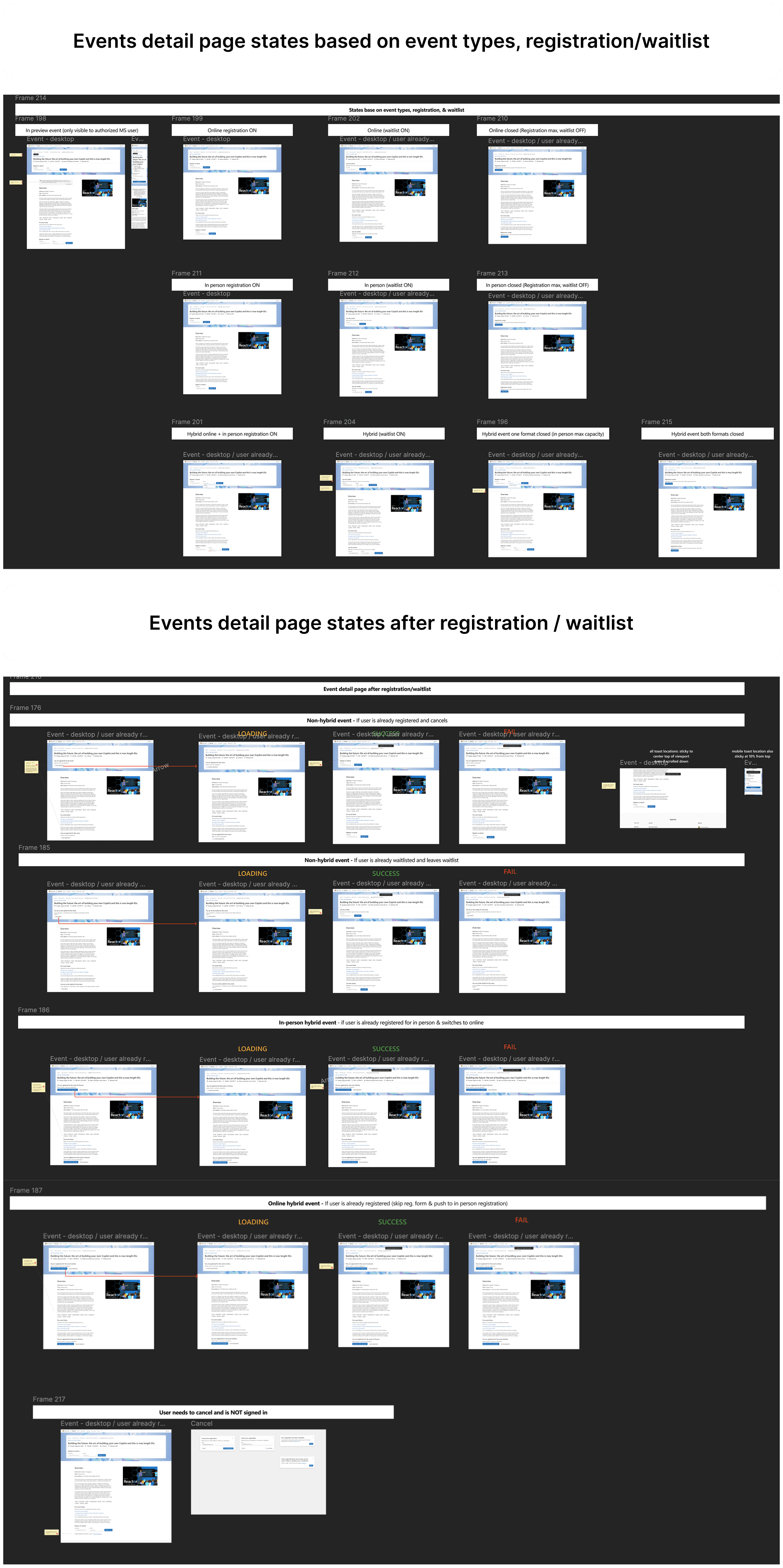
In this project, Reactor had numerous edge cases and user flow scenarios that needed to be accounted for especially for the events detail page.
Reactor had a variety of events. These could be in a state of:
In person only
Online only
Hybrid
New event
Live event
Past event with video
Past event without video
Open registration
Waitlisted
Closed
Private
And each of these types of events had specific and complex flows with a loading, success or fail state.
Below are examples of my comprehensive design that may not all appear in my final prototype.
I designed for a complete redesign of Reactor which also means not forgetting the following states of design:
Error states - 404 pages, validation errors, failures
Loading states - skeleton loaders, progress indicators, empty states
Edge cases - long text/content, no search results, expired events
These are critical designs for a polished user experience.
In this project, Reactor had numerous edge cases and user flow scenarios that needed to be accounted for especially for the events detail page.
Reactor had a variety of events. These could be in a state of:
In person only
Online only
Hybrid
New event
Live event
Past event with video
Past event without video
Open registration
Waitlisted
Closed
Private
And each of these types of events had specific and complex flows with a loading, success or fail state.
Below are examples of my comprehensive design that may not all appear in my final prototype.
08
Profile future exploration
After finishing the Reactor redesign, I had extra time to work with the team to explore a new Profile feature which doesn't currently exist.
Users couldn't change their personal information nor view events that they signed up for.
With the new Profile, the Reactor team specifically wanted to include these features:
See upcoming events they are registered for
See past events they registered for and/or attended
See certificates, vouchers and badges they have received
Update their personal information
Competitive research was already conducted and I drew on inspirations from companies like Eventbrite, Meetup, Reddit, Microsoft Learn and more.
My Profile design exploration sought to consolidate all of these features in a personalized dashboard with a navigation bar.
09
Final Reactor Redesign
My Reactor redesign prototype is best viewed on desktop. Press R to restart from the beginning.
Project Status
This redesign was handed off to development in November 2024. The live site hasn't been updated yet, but you can compare with the original Reactor design here.
10
Conclusion
This project came with unique challenges. The existing Reactor site was poorly documented with outdated screens that didn't match production, making the audit phase feel like detective work. I had to piece together what actually existed before I could improve it.
Despite these constraints, I delivered the complete redesign on schedule and went beyond the original scope. By asking the right questions upfront and working efficiently, I had time to explore additional features and improvements the team hadn't even considered!
Working as the design lead also taught me to filter feedback strategically. While other designers offered input, I learned to evaluate their suggestions against our specific constraints, using my PM as a thought partner to make the right calls.
What I'd Do Differently
My only regret is not being able to see this through implementation. With limited dev resources, the timeline meant I couldn't stay for QA. The project ended at handoff with prototype delivered, technical specs documented, and developers briefed. I would have loved to ensure the design vision translated perfectly to production.
Final Thoughts
This contract role proved that even with limited resources and documentation gaps, thorough discovery and stakeholder collaboration can lead to solutions that exceed expectations. Sometimes the biggest challenge is just figuring out what actually exists before you can improve it.